
Demencija Lietuvoje
UX/UI Design / Web design / 2025
Problem
Dementia-related information in Lithuania is fragmented, difficult to navigate, and often presented in clinical or overwhelming language. People encountering dementia — whether patients, family members, or caregivers — are frequently under emotional stress, time pressure, and cognitive load.
The existing digital presence did not provide a clear entry point for different user needs. Content was difficult to scan, actions were not clearly prioritized, and accessibility considerations were limited. As a result, users struggled to find reliable information, understand available support, or take meaningful next steps such as seeking help, joining events, or supporting the organization.
The core problem was not a lack of content, but the absence of a calm, structured, and accessible system that could support users at different stages of the dementia journey.
Solution
The solution was to design a clear, accessible, and human-centered digital platform that reduces cognitive load and guides users through complex information with clarity and care.
The platform was restructured around a simplified information architecture, predictable navigation, and progressive disclosure of content. Visual and interaction design decisions prioritize readability, emotional safety, and accessibility, ensuring that users can quickly understand where they are, what options are available, and what to do next.
By treating accessibility and clarity as core design principles — not constraints — the platform becomes a supportive tool rather than a source of friction, enabling users to find information, access services, and engage with the organization with confidence.
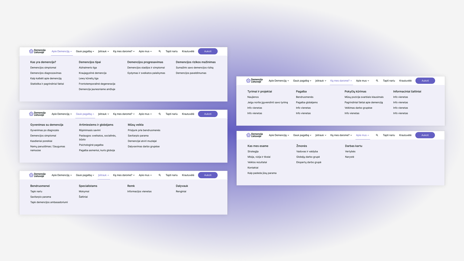
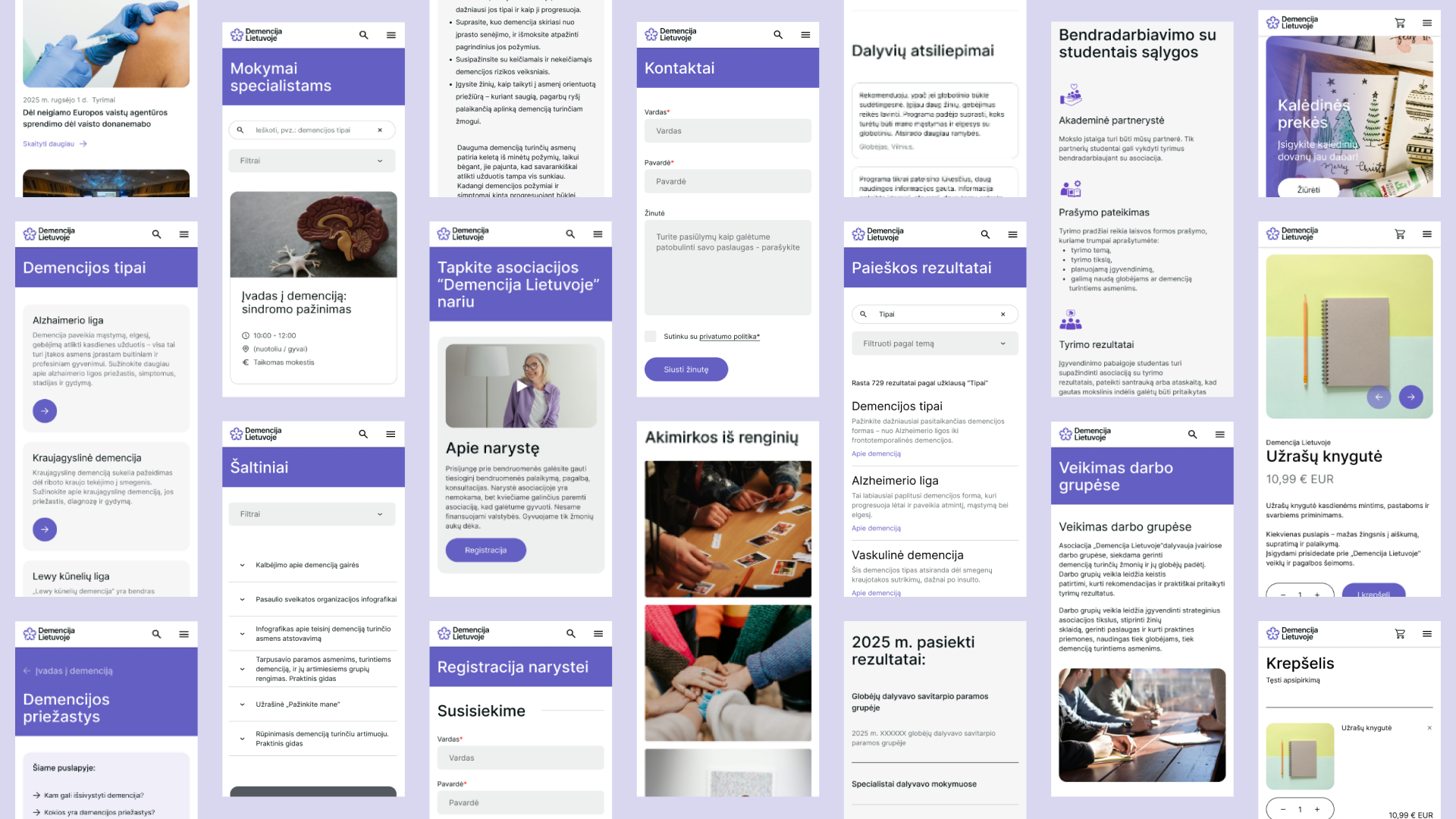
Structuring Complex Information for Different Audiences
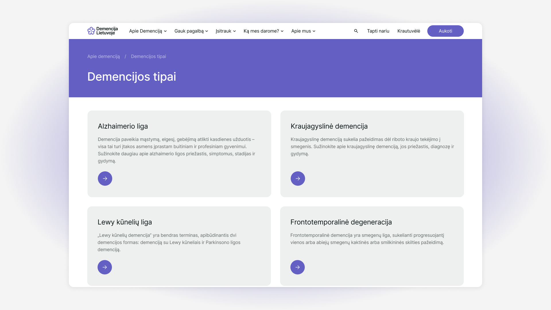
One of the core challenges was the lack of a clear, audience-oriented structure. Dementia-related content often serves very different users — caregivers, professionals, and the general public — yet is usually presented as a single, undifferentiated information stream.
The solution was a clearly structured information architecture that organizes content by user needs and context, allowing people to quickly orient themselves and access relevant information without cognitive overload.
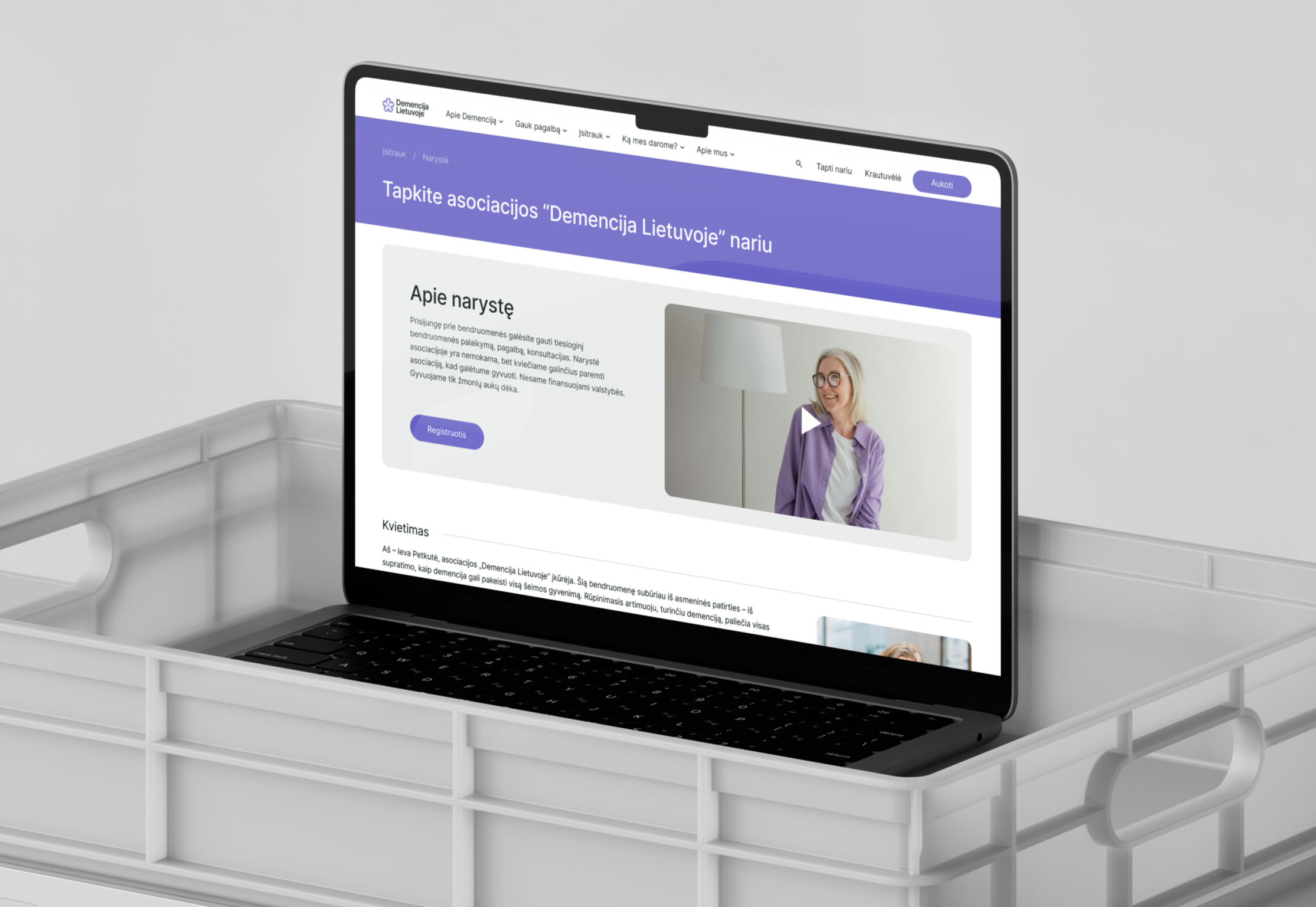
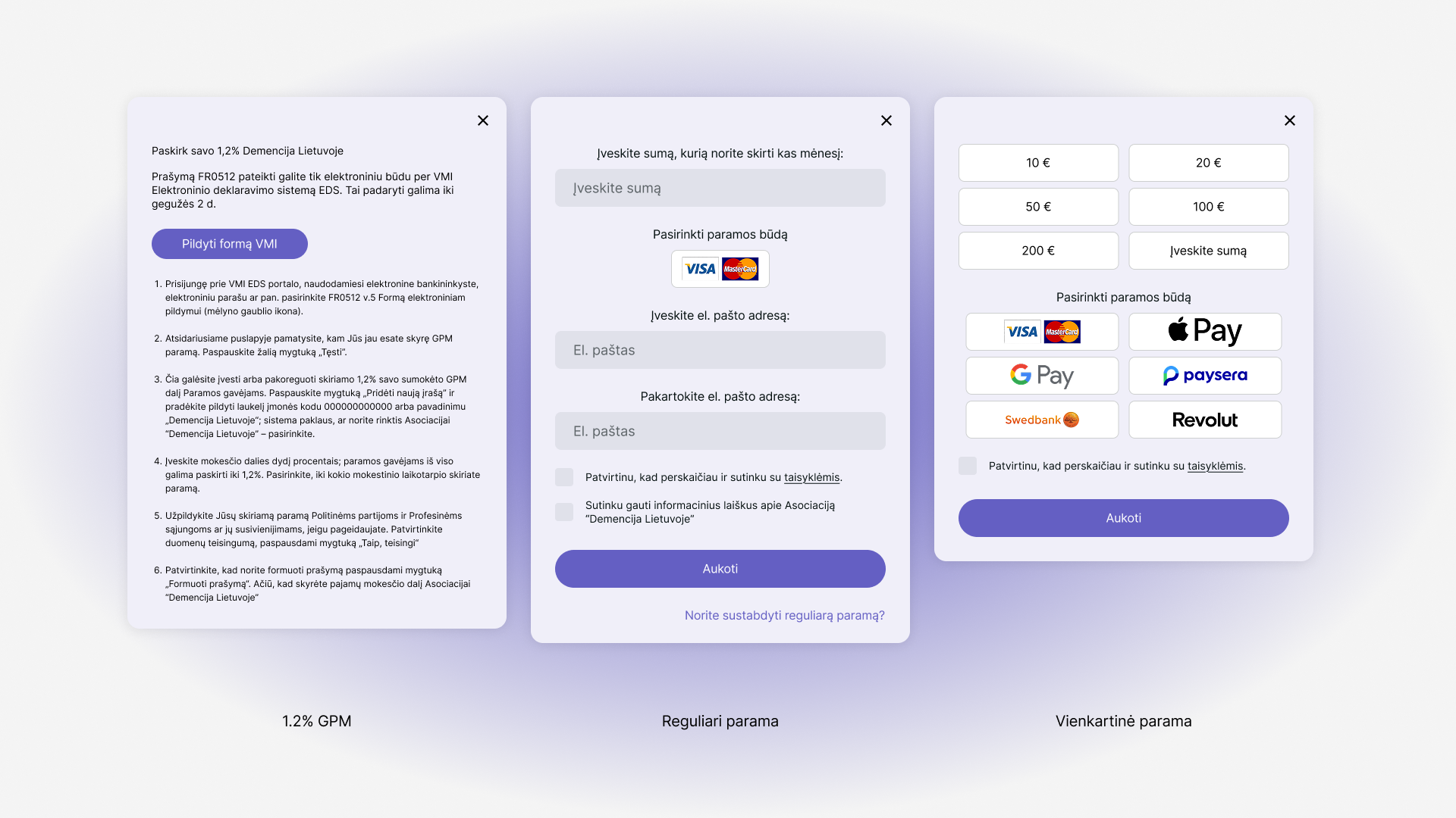
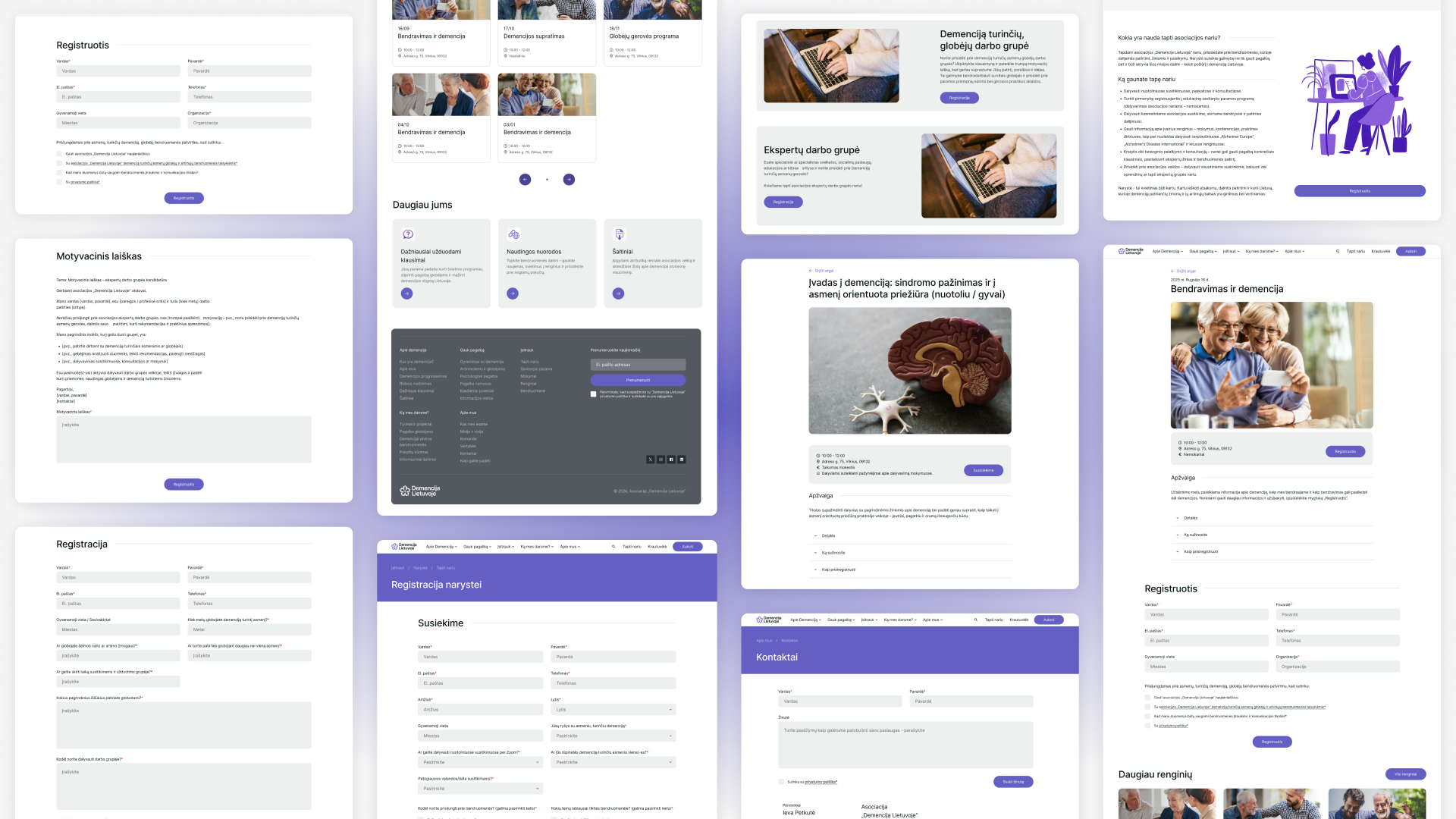
Beyond information, the platform needed to enable action — joining trainings, becoming part of the community, or accessing support. Previously, these processes were fragmented and difficult to navigate.
The redesigned flows simplify registration and participation, guiding users through forms and actions step by step, with clarity and reassurance at each stage.
Lowering Barriers to Participation and Support
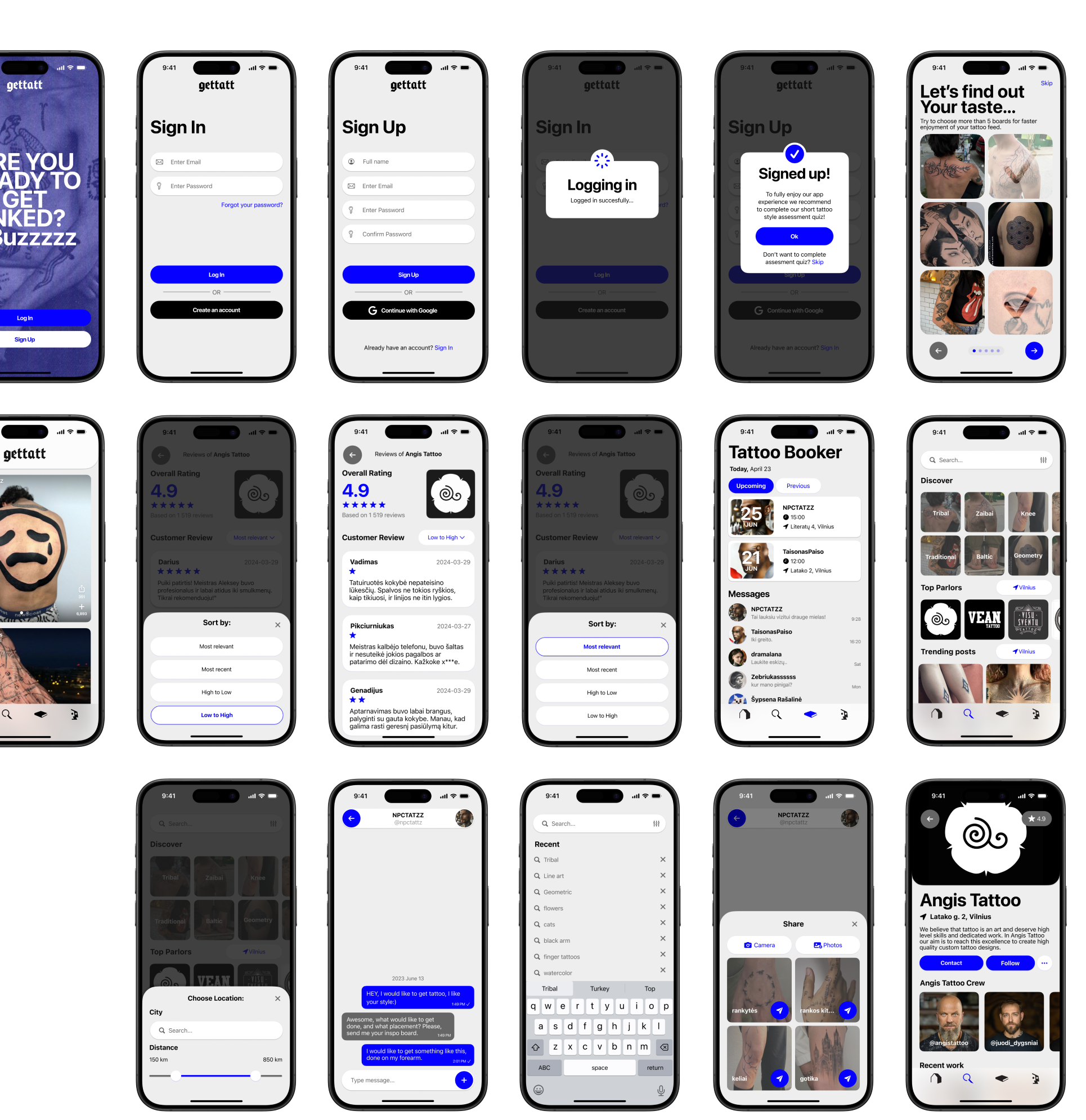
Extensive wireframes were developed to prototype the core features and interactions. I focused on creating a flow that felt familiar but was purpose-built for tattoos—minimizing cognitive load while keeping the experience visually immersive and intuitive.
From Concept to Touchscreen
Lowering Barriers to Participation and Support
Beyond information, the platform needed to enable action — joining trainings, becoming part of the community, or accessing support. Previously, these processes were fragmented and difficult to navigate.
The redesigned flows simplify registration and participation, guiding users through forms and actions step by step, with clarity and reassurance at each stage.
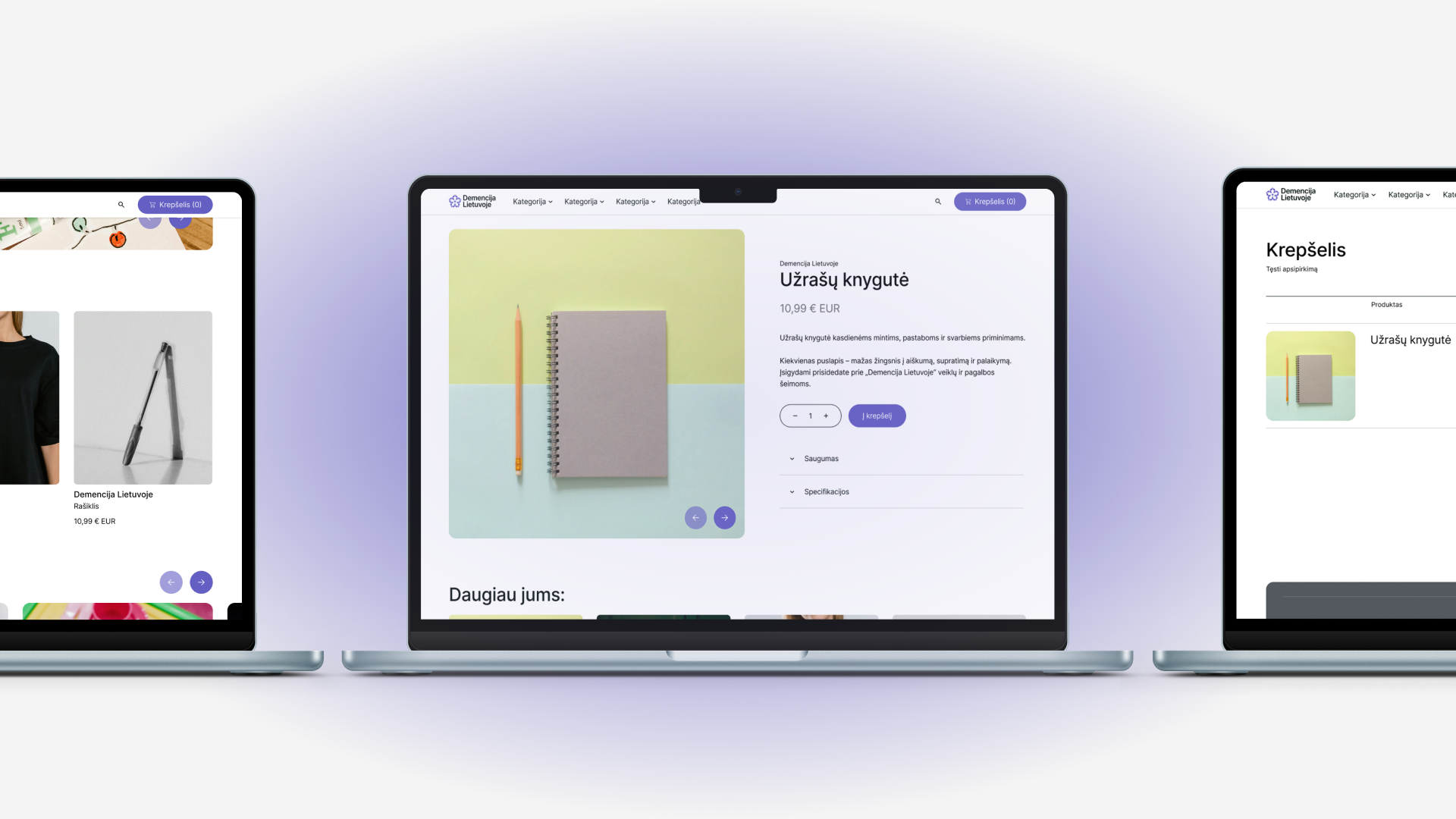
A Social Tattoo Ecosystem
The final UI draws from contemporary visual culture: bold typography, high-contrast elements, and a dark/light interface split that resonates with both clients and creatives. Each screen supports expressive browsing while ensuring usability across devices.
Frictionless Registration
For caregivers and professionals under emotional and time pressure, complex registration flows create unnecessary barriers. The platform simplifies participation by designing clear, step-by-step registration systems for trainings, community groups, and memberships.
Forms are structured, predictable, and cognitively light — reducing friction and enabling users to join, learn, and engage without confusion or overwhelm.
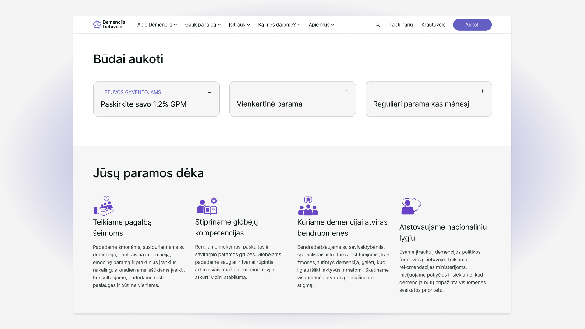
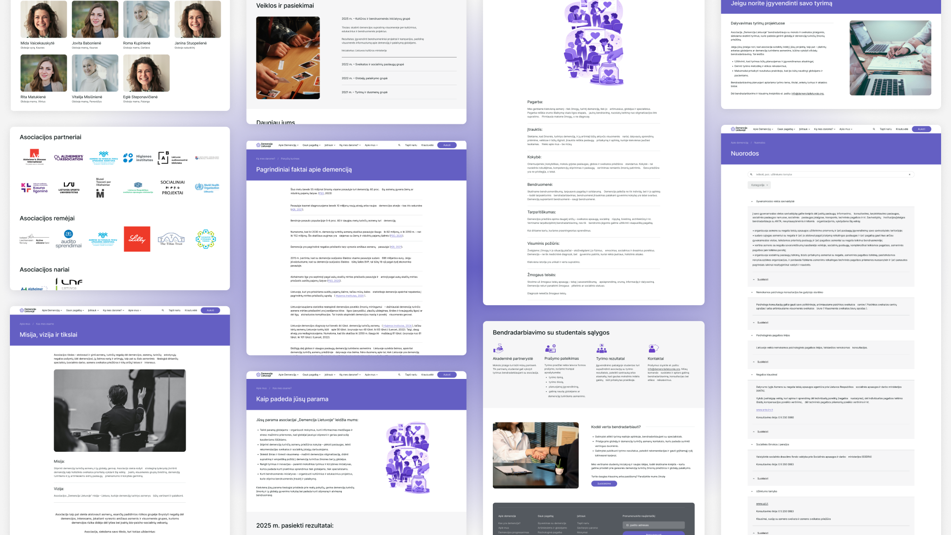
Building Trust Through Transparency
Trust is essential when working with sensitive topics and vulnerable communities. The platform strengthens trust by clearly communicating the organization’s mission, impact, and ways to contribute — without pressure or confusion.
A structured newsletter system, and a fully responsive mobile experience ensure that users can engage with the organization confidently across devices and touchpoints.
Building Trust Through Transparency


Value that was created
The redesigned platform transformed a fragmented information space into a structured, accessible digital ecosystem.
For users, it reduces cognitive load, shortens the path to relevant information, and lowers barriers to participation — whether joining a training, finding support, subscribing to updates, or contributing financially.
For the organization, it establishes a scalable system that supports education, advocacy, and fundraising through clear flows and consistent communication. The platform strengthens credibility, improves operational efficiency, and creates a foundation for long-term digital growth.
More importantly, it reframes design as a support mechanism — not just a visual layer — enabling the organization to serve its community with clarity and dignity.
Dominykas Vascila
Asociacija "Demencija Lietuvoje"
2025-2026