bandom
Branding / 2024
Created in collaboration with Agnė Ašmontaitė
Problem
In today’s saturated creative market, many studios play it safe—leaning into polished but predictable visuals that blend into the noise. Bold ideas are often dulled by conformity, and genuine creative risk is rare. We felt a gap: a lack of studios that truly provoke, disrupt, and get noticed.
Solution
bandom is a creative studio brand built to challenge comfort zones. Through confrontational visuals, oversized typography, and offbeat communication tactics, we designed a brand identity that thrives on tension. It’s not here to please—it’s here to provoke curiosity, spark dialogue, and make you look twice.

A symbol of disruption and duality
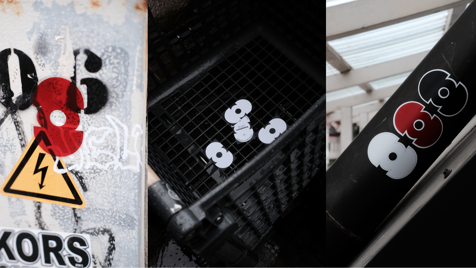
bandom logo fuses the lowercase “b” and “d” into a bold, abstract mark. It’s part eye, part mystery—inviting multiple interpretations. Always shown vertically or horizontally, it reflects the brand’s core: strict, strange, and visually unforgettable.

We used Owners XWide typeface to push impact. Stretched and unapologetic, it dominates space and demands attention. The mix of ultra-bold headers and minimalist body text keeps things punchy but readable—just how bandom speaks.
Loud, wide, and impossible to ignore
Extensive wireframes were developed to prototype the core features and interactions. I focused on creating a flow that felt familiar but was purpose-built for tattoos—minimizing cognitive load while keeping the experience visually immersive and intuitive.
From Concept to Touchscreen
Loud, wide, and impossible to ignore
We used Owners XWide typeface to push impact. Stretched and unapologetic, it dominates space and demands attention. The mix of ultra-bold headers and minimalist body text keeps things punchy but readable—just how bandom speaks.


A Social Tattoo Ecosystem
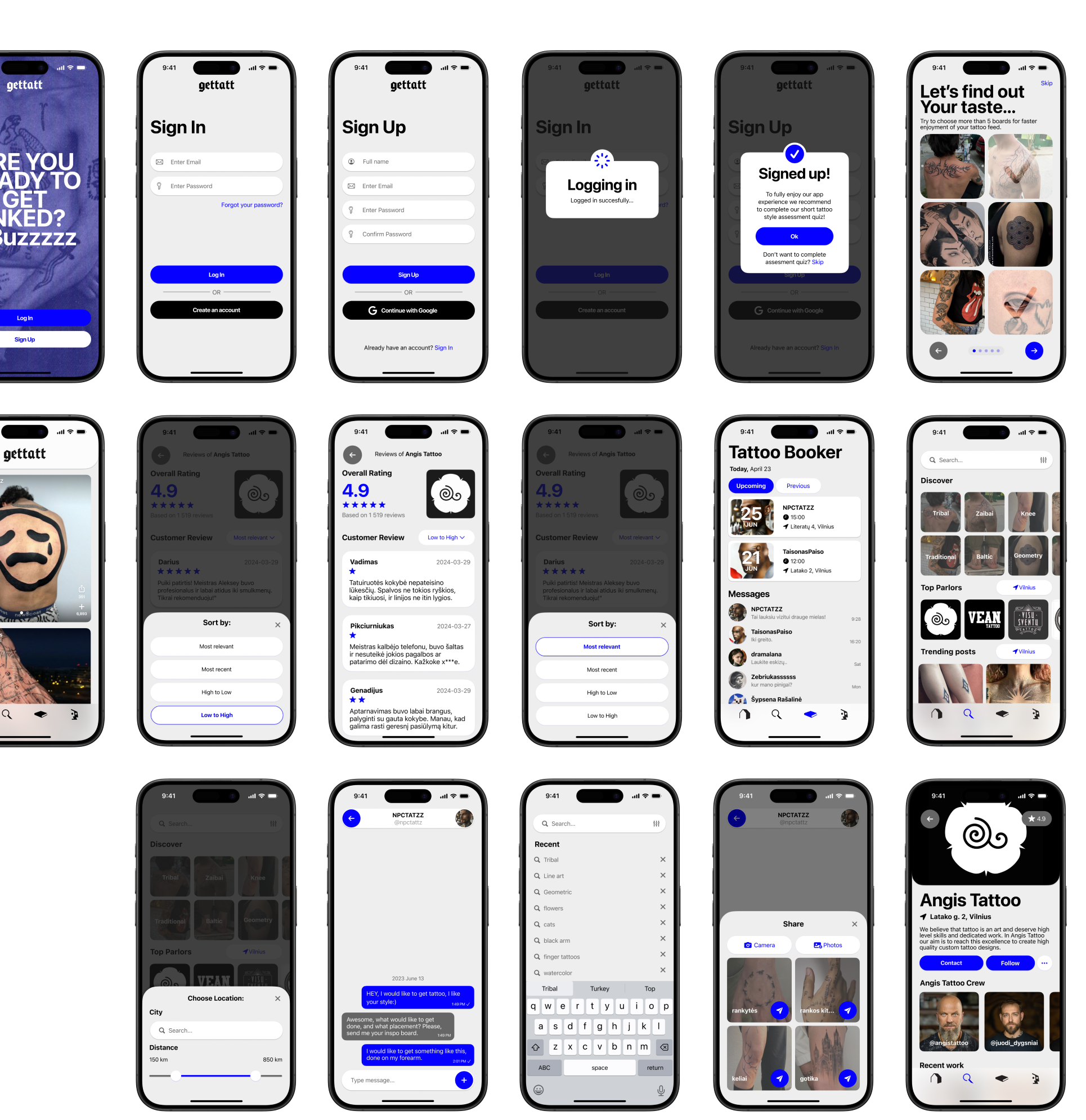
The final UI draws from contemporary visual culture: bold typography, high-contrast elements, and a dark/light interface split that resonates with both clients and creatives. Each screen supports expressive browsing while ensuring usability across devices.
Weird formats, bold statements
bandom visual voice extends beyond screens—into soap bars, invoices, stickers, and street billboards. Every touchpoint is a chance to disrupt. Whether it’s a “business soap” or a type-heavy invoice, the message is clear: creativity has no fixed format. We turn everyday objects into brand experiments that provoke and stick.

Explore Artists
& Salons
Find top-rated salons or artists in your city with a few taps. Each profile includes crew info, work samples, and real customer reviews. It’s a transparent way to build trust and choose the right fit, backed by a clear 5-star rating system.
Find top-rated salons or artists in your city with a few taps. Each profile includes crew info, work samples, and real customer reviews. It’s a transparent way to build trust and choose the right fit, backed by a clear 5-star rating system.
Explore Artists
& Salons


Book & Chat
The in-app booking tool lets users set appointments, rate visits, and message artists or salons directly. It replaces awkward DMs with clean, focused communication—and keeps your whole tattoo journey in one place.


Value that was created
bandom taught us how far a brand can go when you drop the rules and trust the concept. This project pushed us to think beyond traditional identity systems and explore how design can live in unexpected places. As a designer, I gained confidence in bold decision-making, brand storytelling, and turning discomfort into a deliberate visual tool. It was also a strong collaboration exercise—balancing vision, critique, and execution as a team.
Dominykas Vascila
Vilnius Academy of Arts
2024
